DESIGN | JUST HANGING
DESIGN | JUST HANGING
Words by Georgia Austin.
The art of displaying art.
There’s something quietly captivating about a beautifully hung piece of artwork. Not just the piece itself, but the way it holds space, as if the room was waiting for it, and everything else falls into place once it’s there.
And yet, it’s surprisingly easy to get wrong. Too high and it floats, too small and it disappears. However, there are a few simple rules of thumb that, when followed, ensure the artworks feels intentional.
MEET THE EYE
The first rule of hanging art is positioning it at a comfortable height, where it can be appreciated without effort. There’s a magic number for this: the focal point – the centre of your piece, not the bottom edge – should be 57 to 60 inches from the floor. This puts it at average eye level, bringing the piece into conversation with its surroundings, rather than floating above or below them.
This simple guideline applies regardless of the size of the painting or the height of your ceilings. This is one instance where you should trust the maths – not your instincts.
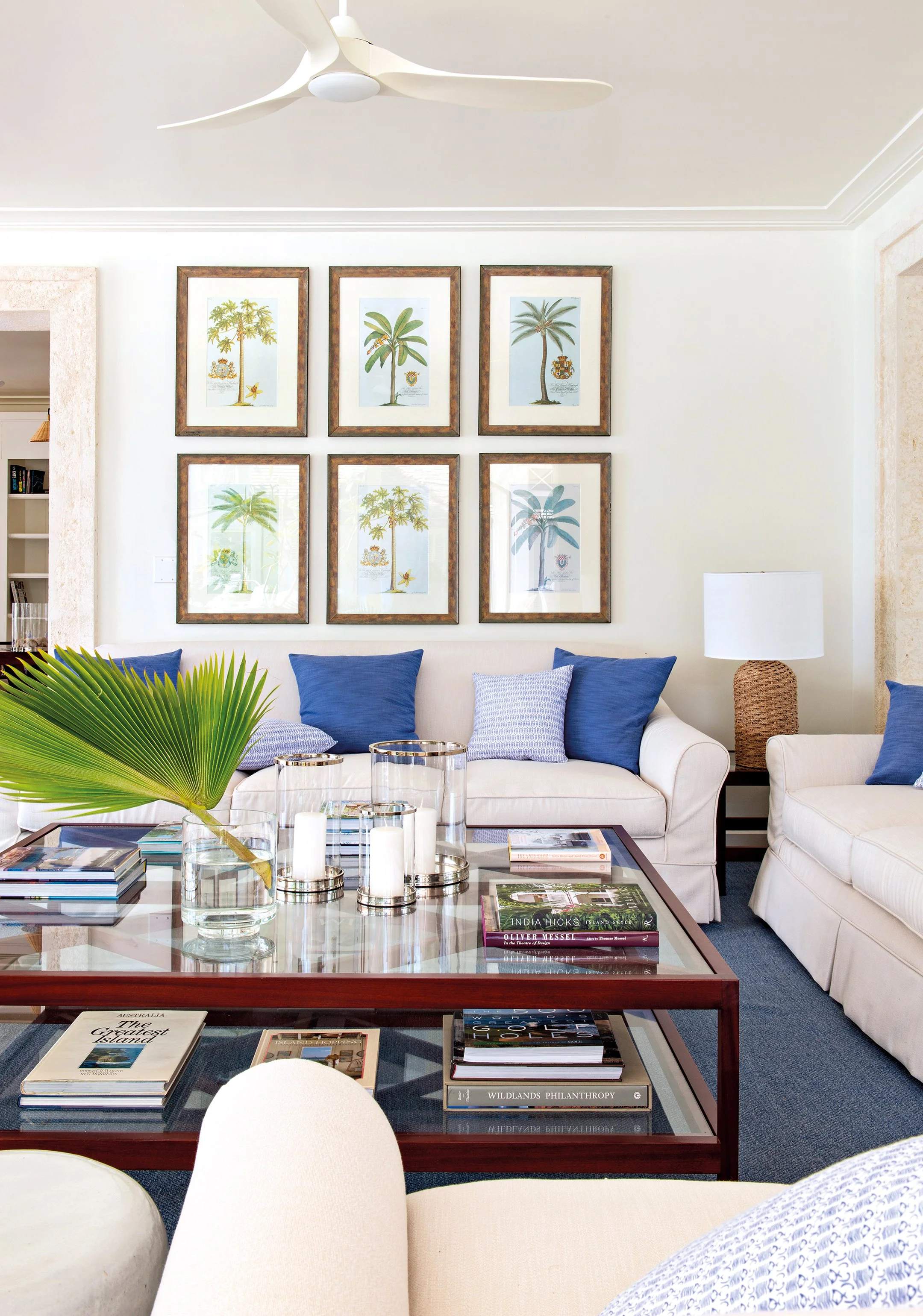
THE BIG PICTURE
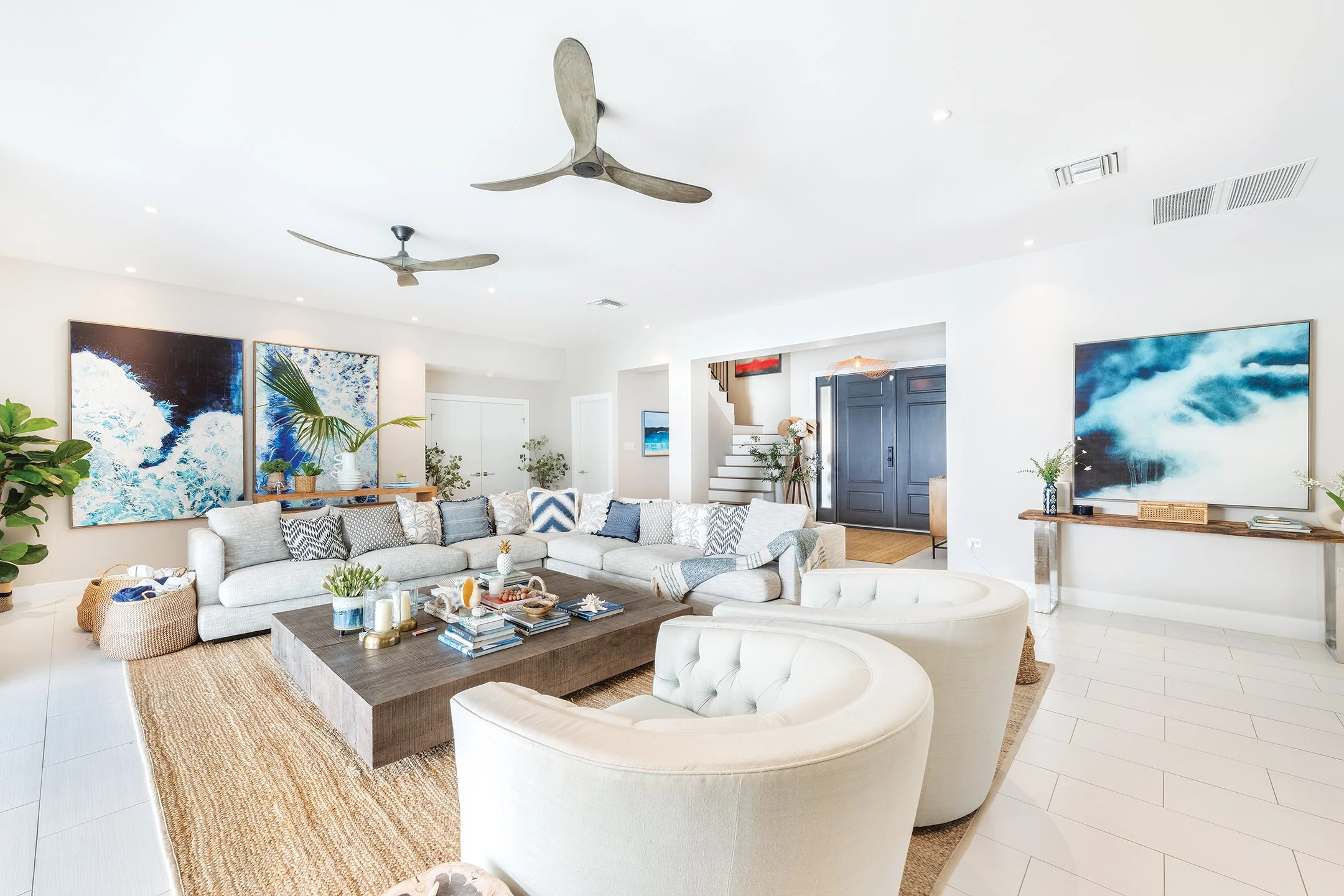
Unlike galleries, art in the home needs to sit proportionally with the furniture in the room. A tiny painting centred over a three-seater sofa feels apologetic, and a large-scale canvas over a dainty console table is likely overpowering. Again, simple maths will help you here.
A good guideline is that a piece should span two-thirds of the width of the furniture below. So, if you have a 90-inch couch, aim for a piece – or collection of pieces – roughly 60 inches across.
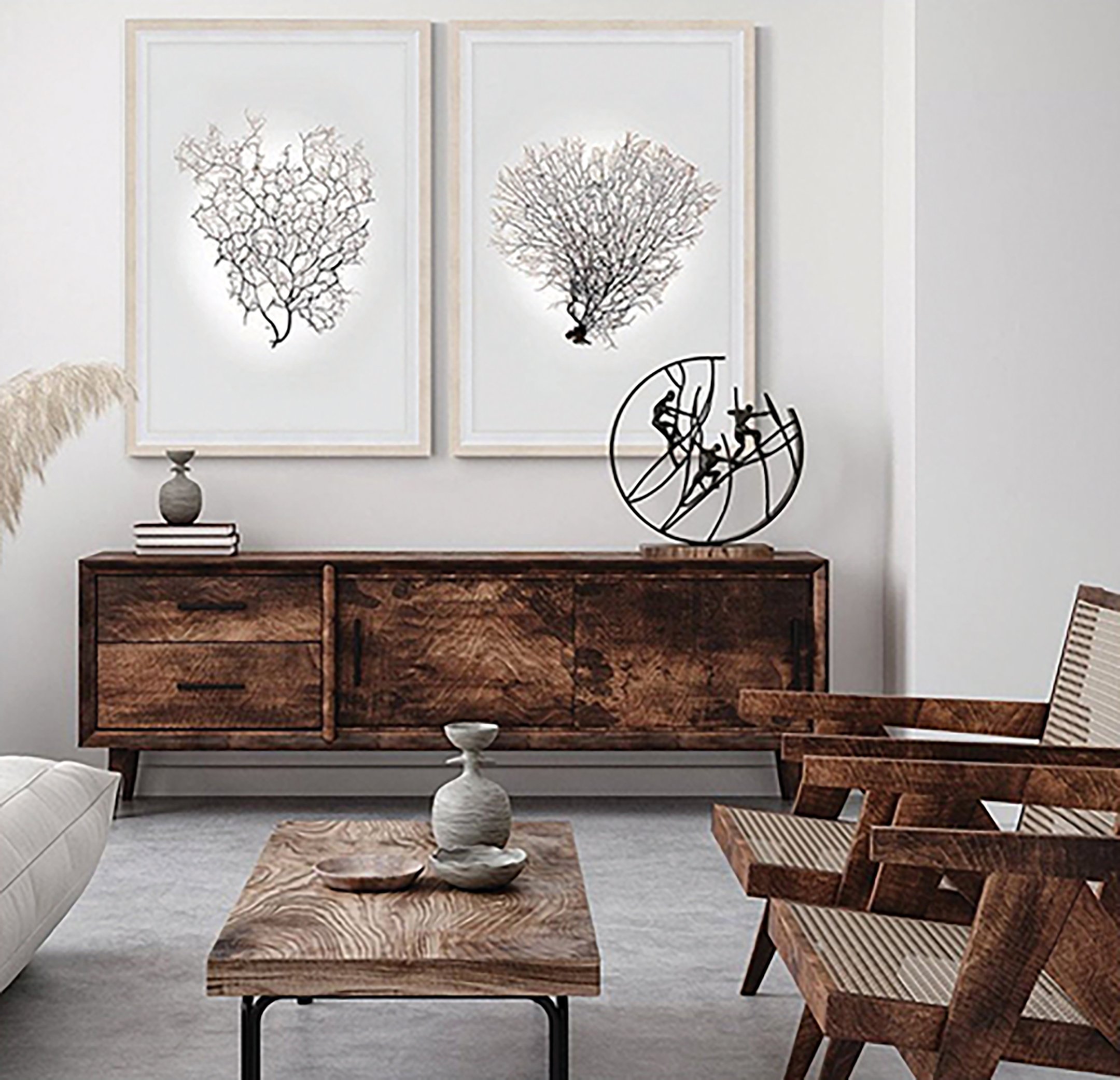
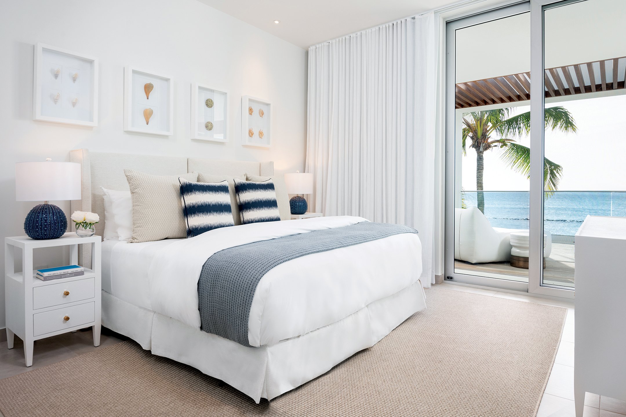
When hanging art above furniture that sits against a wall, such as a bed or dresser, leave three to six inches between the top of the furniture and the bottom of the frame.
THE SPACE BETWEEN
Every piece of art needs room to breathe. When hanging multiple pieces – a great solution when you don’t have a single piece large enough for the space – leave three to six inches between larger works, and two to three inches between smaller ones.
If you’re creating a gallery wall, the key to making it feel cohesive is consistent spacing. If your collection hangs over a piece of furniture, apply the two-thirds rule to the entire collection as if it were a single unit.
To avoid mistakes when planning a gallery wall, mark out your frames directly on the wall with masking tape, or try one of the many room planning apps to help you visualise artwork placement before committing to hammers and hooks.
LET THE ROOM LEAD
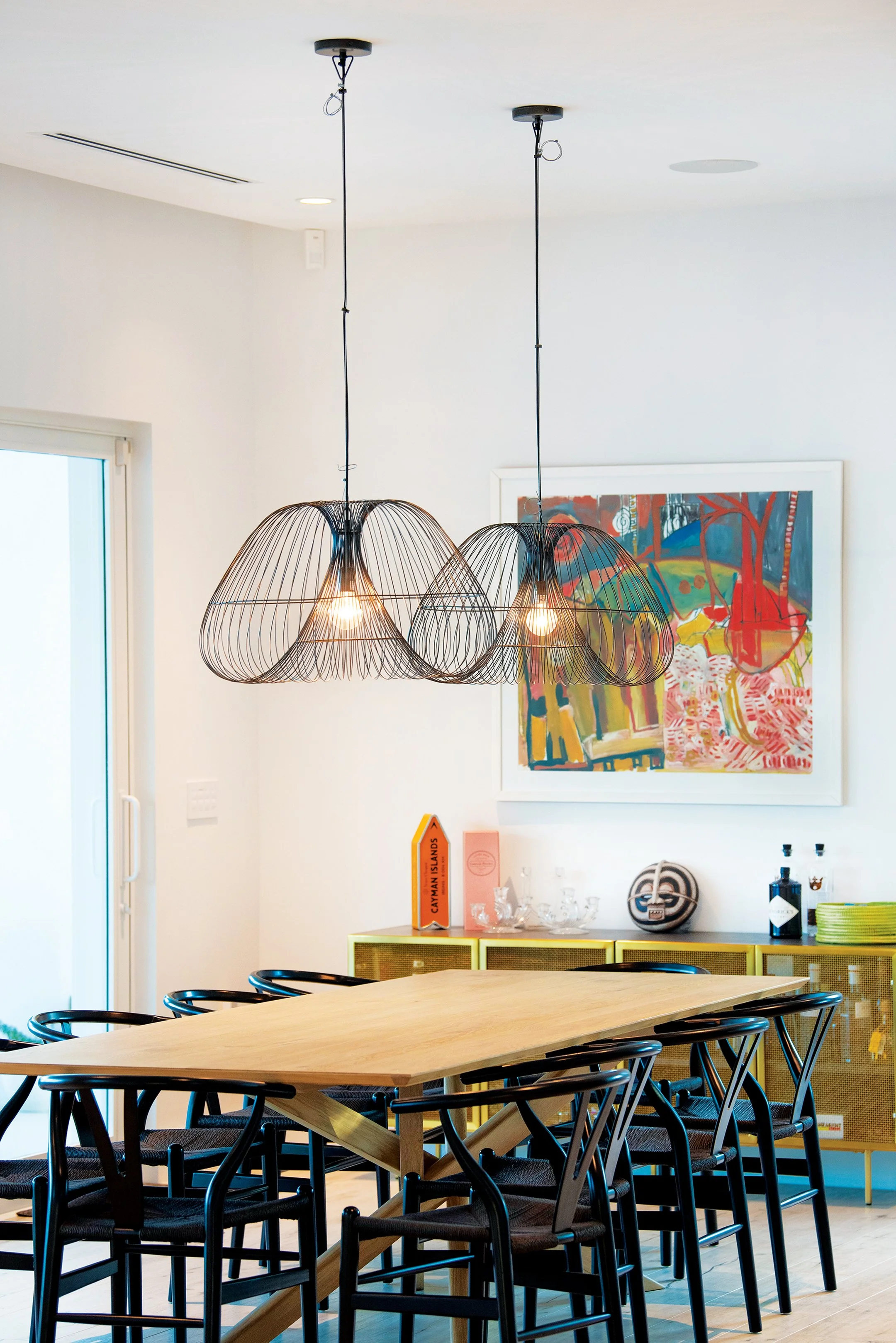
Different rooms need different energy. A bedroom might call for gentle scenes and soft tones that soothe. A dining room might benefit from something bold and expressive – an abstract painting or large-scale photography, for instance – that sparks conversation. And in open-plan spaces, a well-placed piece can subtly define zones. Consider the atmosphere you want to create and let the purpose of the room guide the art.
BEYOND THE WALL
Well-placed art has the power to anchor a room, delineate space or set a mood. But art isn’t only about decoration. It’s about expression. So have fun with it and break the rules if it feels right. After all, true design is not simply the act of placing, but the effect that is created when the art fits the space and the space fits the person.